# Load necessary packages using pacman for easier dependency management
pacman::p_load(
  glue,
  tidyverse,   # Collection of R packages for data science (ggplot2, dplyr, etc.)
  showtext,    # Enables custom fonts for ggplot2
  ggtext,      # Adds rich text formatting to ggplot2
  skimr       # Provides summary statistics in a readable format
)

# Add custom Google fonts for use in plots
font_add_google("Monsieur La Doulaise")  # Decorative script font for titles
font_add_google("Roboto Condensed")      # Modern condensed font for body text
font_add_google("Roboto")                # Clean sans-serif font for captions

# Load a specific font from a local file (Font Awesome for branding/icons)
font_add("Font Awesome 6 Brands", here::here("fonts/otfs/Font Awesome 6 Brands-Regular-400.otf"))

# Assign font names to variables for easy application in plots
title <- "Monsieur La Doulaise"
text <- "Roboto Condensed"
caption <- "Roboto"

# Automatically enable the use of showtext for all plots
showtext_auto()

# Set DPI for high-resolution text rendering
showtext_opts(dpi = 300)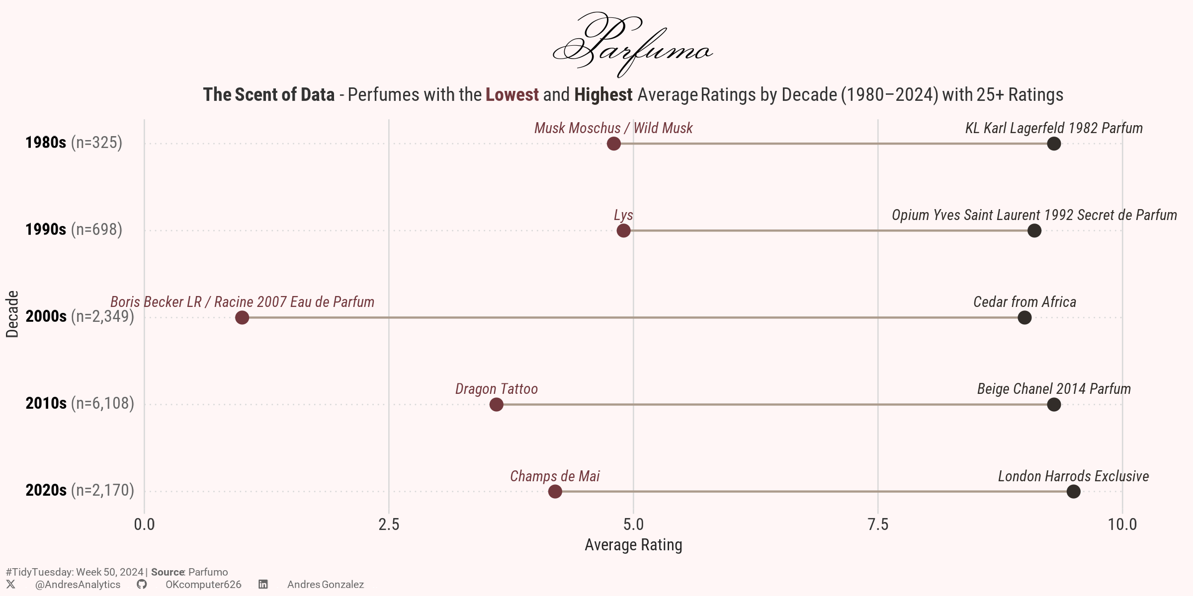
How This Graphic Was Made
1. 📦 Load Packages & Setup
2. 📖 Read in the Data
# Load the TidyTuesday data
tuesdata <- tidytuesdayR::tt_load(2024, week = 50)

# Extract and assign the specific dataset (parfumo_data_clean) from the loaded list
parfumo_data_clean <- tuesdata$parfumo_data_clean

# Display the README file for the dataset, providing context and data dictionary
tidytuesdayR::readme(tuesdata)

# Remove the original list (tuesdata) from the environment to free up space
rm(tuesdata)
3. 🕵️ Examine the Data
# Display a glimpse of the parfumo_data_clean dataset, showing its structure and a preview of columns
glimpse(parfumo_data_clean)

# Generate a detailed summary of the dataset, including descriptive statistics for each column
skim(parfumo_data_clean)
4. 🤼 Wrangle Data
# Filter perfumes released between 1980 and 2024 with more than 25 ratings,
# and create a 'decade' column for grouping
df1 <- parfumo_data_clean %>%
  filter(between(Release_Year, 1980, 2024),
         Rating_Count > 25) %>%
  mutate(decade = floor(Release_Year / 10) * 10,
         decade = glue::glue("{decade}s"))

# Summarize ratings by decade, find the highest and lowest-rated perfumes,
# and reshape the data for visualization
df2 <- df1 %>%
  group_by(decade) %>%
  summarise(n = n(),
            min_rating = min(Rating_Value),
            max_rating = max(Rating_Value),
            name_min_rating = Name[which.min(Rating_Value)],
            name_max_rating = Name[which.max(Rating_Value)]) %>%
  pivot_longer(
    cols = min_rating:max_rating,
    names_to = "type",
    values_to = "value"
  ) %>%
  mutate(
    names = if_else(type == "min_rating", name_min_rating, name_max_rating),
    ylab = glue::glue("<span style='color:black'>**{decade}**</span> (n={scales::comma(n, accuracy=1)})")
  ) %>%
  ungroup() %>%
  select(-c(name_min_rating, name_max_rating))
5. 🔤 Text
# Create a social media caption with customized colors and font for consistency in visualization
social <- andresutils::social_caption(icon_color = "grey40", font_color = "grey40", font_family = caption)

# Construct the final plot caption by combining TidyTuesday details, data source, and the social caption
cap <- paste0(
  "#TidyTuesday: Week 50, 2024 | **Source**: Parfumo <br>", social
)
6. 📊 Plot
# Plot perfumes with the highest and lowest average ratings by decade (1980–2024, 25+ ratings).
p <- df2 %>%
  ggplot(aes(x = value, y = fct_rev(ylab), color = type, group = ylab, label = names)) +
  geom_line(color="#AC9C8D") +
  geom_point(size = 2.5) +
  geom_text(size = 2.5, vjust = -1, family = text, fontface = "italic") +
  scale_x_continuous(limits = c(0, 10), breaks = seq(0, 10, by = 2.5), expand = c(0,0)) +
  scale_y_discrete(expand = expansion(mult = c(.05, .07))) +
  scale_color_manual(values = c("#322D29", "#72383D")) +
  coord_cartesian(clip = "off") +
  cowplot::theme_minimal_grid(9.5,line_size = 0.3) +
  theme(
    text = element_text(family = text),
    axis.title = element_text(color = "grey15", size = 8),
    axis.text.y = element_markdown(hjust = 0, color = "grey40"),
    axis.text.x = element_text(color = "grey20"),
    plot.margin = margin(.1,1.2,.1,.1, unit="cm"),
    plot.title = element_markdown(size = 25, hjust = 0.5, family = title),
    plot.subtitle = element_markdown(hjust = 0.5, size = 9, margin = margin(b=7), color = "grey20"),
    plot.background = element_rect(fill = "#fff6f6"),
    plot.caption = element_textbox_simple(margin = margin(t=7), hjust = 0, size = 5, color = "grey40", family = caption),
    plot.caption.position = "plot",
    axis.ticks.y = element_blank(),
    panel.grid.major.y = element_line(linetype = "dotted"),
    legend.position = "none",
  ) +
  labs(
    title = "Parfumo",
    subtitle = "**The Scent of Data** - Perfumes with the <span style='color:#72383D;'>**Lowest**</span> and <span style='color:#322D29;'>**Highest**</span> Average Ratings by Decade (1980–2024) with 25+ Ratings",
    caption = cap,
    x = "Average Rating", y = "Decade")
7. 💾 Save
# Save the plot for TidyTuesday 2024, Week 50 with specified dimensions.
andresutils::save_plot(p, type = "tidytuesday", year = 2024, week = 50, width = 8, height = 4)
8. 🚀 GitHub Repository
TipExpand for GitHub Repo
The complete code for this analysis is available in tt_50_2024.qmd.
For the full repository, click here.
Citation
For attribution, please cite this work as:
Gonzalez, Andres. 2024. “The Scent of Data.” December 20,
2024. https://andresgonzalezstats.com/visualization/TidyTuesday/2024/Week_50/tt_50_2024.html.