# Load necessary packages using pacman for easier dependency management
pacman::p_load(
  tidyverse,   # Collection of R packages for data science (ggplot2, dplyr, etc.)
  showtext,    # Enables custom fonts for ggplot2
  ggtext,      # Adds rich text formatting to ggplot2
  skimr,       # Provides summary statistics in a readable format
  janitor,
  glue
)

# Add Google fonts
font_add_google("Roboto Condensed", family = "Roboto")
font_add_google("Oswald")

# Add local font
font_add("Font Awesome 6 Brands", here::here("fonts/otfs/Font Awesome 6 Brands-Regular-400.otf"))

# Automatically enable the use of showtext for all plots
showtext_auto()

# Set DPI for high-resolution text rendering
showtext_opts(dpi = 300)How This Graphic Was Made
1. 📦 Load Packages & Setup
2. 📖 Read in the Data
3. 🕵️ Examine the Data
glimpse(water_insecurity_2022)
skim(water_insecurity_2022)

glimpse(water_insecurity_2023)
skim(water_insecurity_2023)
4. 🤼 Wrangle Data
california_water <- water_insecurity_2022 %>%
  inner_join(
    water_insecurity_2023,
    by = c("geoid", "name"),
    suffix = c("_2022", "_2023")
  ) %>%
  filter(str_detect(name, "California")) %>%
  mutate(
    difference = percent_lacking_plumbing_2023 - percent_lacking_plumbing_2022,
    pct_change = case_when(
      percent_lacking_plumbing_2022 == 0 & percent_lacking_plumbing_2023 > 0 ~ 100,  # Assign 100% if increasing from 0
      percent_lacking_plumbing_2022 == 0 & percent_lacking_plumbing_2023 == 0 ~ 0,    # No change if both are 0
      TRUE ~ round((difference / percent_lacking_plumbing_2022) * 100, 1)
    )
  ) %>%
  drop_na() %>%  # Remove missing values after calculations
  pivot_longer(
    cols = starts_with("percent"),
    names_to = "year",
    values_to = "amount"
  ) %>%
  mutate(
    year = str_replace(year, "percent_lacking_plumbing_", "")
  ) %>%
  mutate(
    county = str_remove(name, " County, California")
  ) %>%
  select(county, year, pct_change, amount)

california_water_decrease <- california_water %>%
  slice_min(pct_change)

california_water_la <- california_water %>%
  filter(county == "Los Angeles")
5. 🔤 Text
title <- "Percentage of the Population Lacking Plumbing in California"

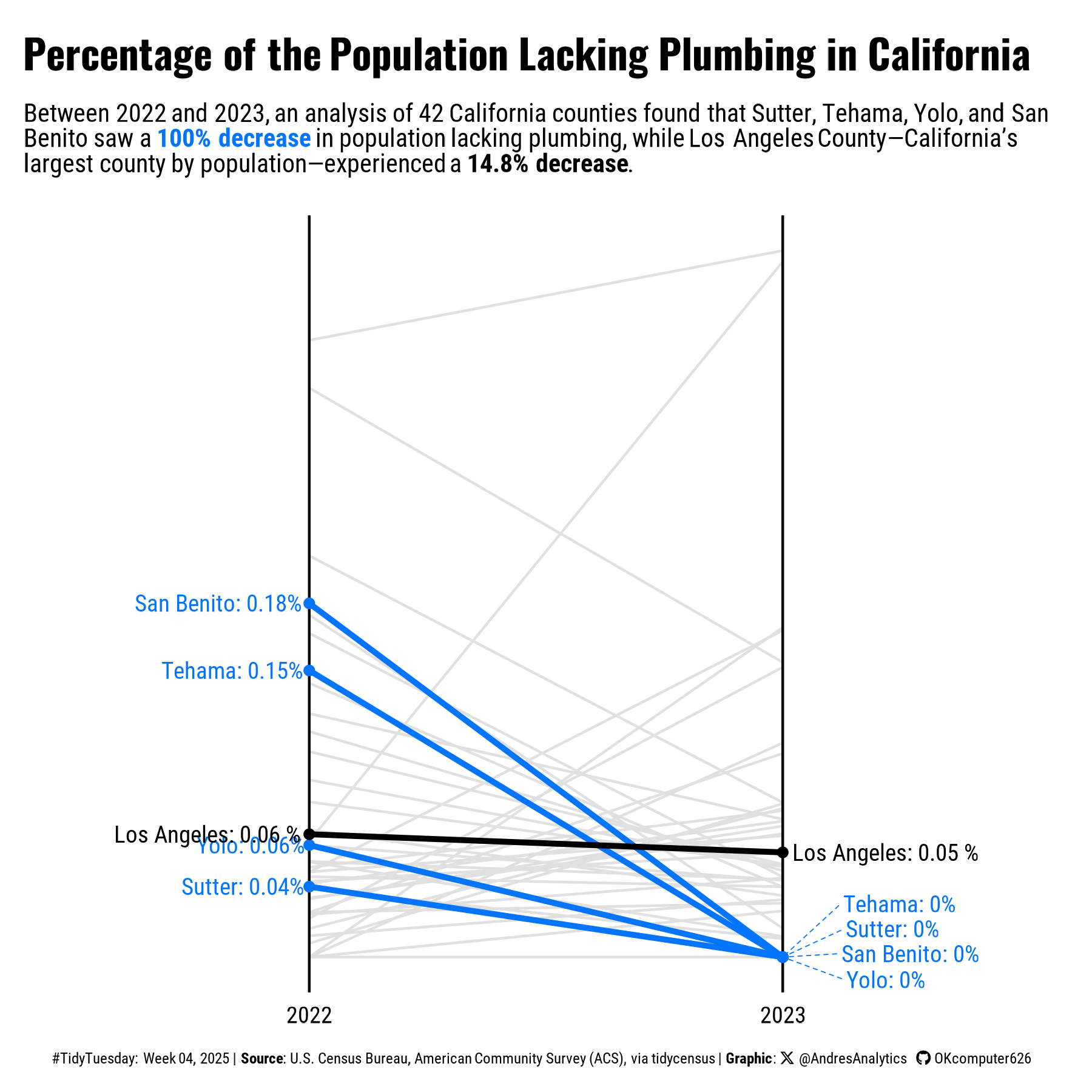
st <- paste("Between 2022 and 2023, an analysis of 42 California counties found that Sutter, Tehama, Yolo, and San Benito saw a ",
            "<span style='color:#0375FC;'>**100% decrease**</span> in population lacking plumbing, while Los Angeles County—California’s largest county by population—experienced a ",
            "**14.8% decrease**.")

# Create a social media caption with customized colors and font for consistency in visualization
social <- andresutils::social_caption(font_family = "Roboto", icon_color = "black")

# Construct the final plot caption by combining TidyTuesday details, data source, and the social caption
cap <- paste0(
  "#TidyTuesday: Week 04, 2025 | **Source**: U.S. Census Bureau, American Community Survey (ACS), via tidycensus | **Graphic**: ", social
)
6. 📊 Plot
p <- california_water %>%
  ggplot(aes(x = year, y = amount, group = county)) +
  geom_line(data = california_water %>% filter(pct_change != min(pct_change), county != "Los Angeles"), color = "#E0E0E0") +
  geom_line(data = california_water %>% slice_min(pct_change), color = "#0375FC", linewidth = 1.1) +
  geom_line(data = california_water %>% filter(county %in% "Los Angeles"), color = "black", linewidth = 1.1) +
  geom_text(data = california_water_decrease %>% filter(year == "2022"), aes(x = year, y = amount, label = paste0(county, ": ", round(amount, 2), "%")), hjust = 1.05, family = "Roboto", size = 3.25, color = "#0375FC") +
  ggrepel::geom_text_repel(data = california_water_decrease %>% filter(year == "2023"), aes(x = year, y = amount, label = paste0(county, ": ", round(amount, 2), "%")), nudge_x = 0.15, segment.size = 0.2, direction = "y", hjust = "left", family = "Roboto", box.padding = 0.1, segment.linetype = 2, size = 3.25, color = "#0375FC") +
  geom_text(data = california_water_la, aes(x = year, y = amount, label = paste0(county, ": ", round(amount, 2), " %"),  hjust = if_else(year == "2022", 1.05, -0.05)), family = "Roboto", size = 3.25, color = "black") +
  geom_vline(xintercept = "2022", linewidth = 0.5, color = "black") +
  geom_vline(xintercept = "2023", linewidth = 0.5, color = "black") +
  geom_point(data = california_water_decrease, aes(x = year, y = amount), color = "#0375FC") +
  geom_point(data = california_water_la, aes(x = year, y = amount), color = "black") +
  coord_cartesian(clip = "off") +
  labs(title = title,
       subtitle = st,
       caption = cap) +
  theme_void() +
  theme(plot.title = element_textbox_simple(family = "Oswald", size = 16, face = "bold", color = "black", margin = margin(b = 5, t = 5)),
        plot.title.position = "plot",
        plot.subtitle = element_textbox_simple(family = "Roboto", size = 10, color = "black", margin = margin(b = 15, t = 5), lineheight = 1),
        plot.caption.position = "plot",
        plot.caption = element_textbox_simple(size = 6, family = "Roboto", color = "black", margin = margin(t = 15), halign = 0.5),
        axis.text.x = element_text(family = "Roboto", size = 9, hjust = 0.5, color = "black", vjust = -2),
        plot.margin = margin(10, 10, 10, 10),
        plot.background = element_rect(color = NA, fill = "#FFFFFF"))
7. 💾 Save
# Save plot with dimensions
andresutils::save_plot(p, type = "tidytuesday", year = 2025, week = 4, width = 6, height = 6)
8. 🚀 GitHub Repository
TipExpand for GitHub Repo
The complete code for this analysis is available in tt_04_2025.qmd.
For the full repository, click here.
Citation
For attribution, please cite this work as:
Gonzalez, Andres. 2025. “Water Insecurity.” February 1,
2025. https://andresgonzalezstats.com/visualization/TidyTuesday/2025/Week_04/tt_04_2025.html.
