# Load packages
pacman::p_load(
  tidyverse,
  showtext,
  ggtext,
  skimr,
  glue
)

# Add Google fonts
font_add_google("Roboto Condensed")
font_add_google("Oswald")

# Add local font
font_add("Font Awesome 6 Brands", here::here("fonts/otfs/Font Awesome 6 Brands-Regular-400.otf"))

# Enable custom fonts
showtext_auto()
showtext_opts(dpi = 300)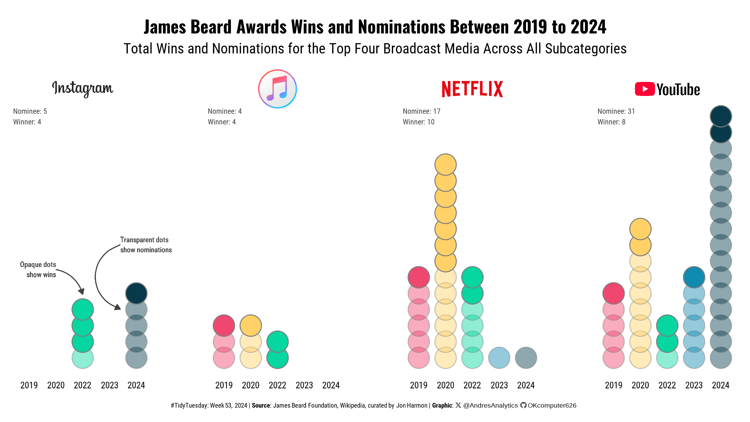
How This Graphic Was Made
1. 📦 Load Packages & Setup
2. 📖 Read in the Data
3. 🕵️ Examine the Data
# View data structure
glimpse(broadcast_media)

# Summary statistics
skim(broadcast_media)
4. 🤼 Wrangle Data
# Step 1: Get top 4 affiliations by frequency
top_affiliations <- broadcast_media %>%
  filter(year >= max(year) - 5) %>%
  mutate(affiliation = str_split(affiliation, ",")) %>%
  unnest(affiliation) %>%
  mutate(affiliation = str_trim(affiliation),
         affiliation = str_to_lower(affiliation)) %>%
  group_by(affiliation) %>%
  count() %>%
  ungroup() %>%
  slice_max(order_by = n, n = 4, with_ties = FALSE) %>%
  pull(affiliation)

# Step 2: Filter rows with top affiliations
df <- broadcast_media %>%
  filter(year >= max(year) - 5) %>%
  mutate(affiliation = str_split(affiliation, ",")) %>%
  unnest(affiliation) %>%
  mutate(affiliation = str_trim(affiliation),
         affiliation = str_to_lower(affiliation)) %>%
  filter(str_detect(affiliation, paste(top_affiliations, collapse = "|"))) %>%
  mutate(affiliation = str_extract(affiliation, paste(top_affiliations, collapse = "|")))

# Step 3: Map logos to affiliations
logo_df <- tribble(
  ~affiliation, ~logo,
  "youtube", "youtube_logo.png",
  "netflix", "netflix_logo.png",
  "itunes", "itunes_logo.png",
  "instagram", "instagram_logo.png"
) |>
  mutate(
    logo = here::here("visualization", "TidyTuesday", "2024", "Week_53", "logo", logo)
  )

df <- df %>%
  left_join(logo_df, by = "affiliation") %>%
  mutate(
    logo_label = glue("<img src='{logo}' width='{ifelse(affiliation == 'itunes', 30, 50)}'/>")
  )

# Step 5: Count rank occurrences per affiliation
results <- df %>%
  group_by(affiliation, rank) %>%
  count() %>%
  arrange(desc(n))

# Step 6: Create summary text for plot facets
results_text <- results %>%
  mutate(text = glue("{rank}: {n}")) %>%
  group_by(affiliation) %>%
  summarise(summary = paste(text, collapse = "\n"), .groups = "drop")

# Step 7: Attach summary text to data for plotting
df <- df %>%
  left_join(results_text, by = "affiliation")

# Step 8: Print dataframe for validation
print(df)
5. 🔤 Text
title <- "James Beard Awards Wins and Nominations Between 2019 to 2024"

subtitle <- "Total Wins and Nominations for the Top Four Broadcast Media Across All Subcategories"

# Create a social media caption with customized colors and font for consistency in visualization
social <- andresutils::social_caption(font_family = "Roboto Condensed", icon_color = "grey25")

# Construct the final plot caption by combining TidyTuesday details, data source, and the social caption
cap <- paste0(
  "#TidyTuesday: Week 53, 2024 | **Source**: James Beard Foundation, Wikipedia, curated by Jon Harmon | **Graphic**: ", social
)
6. 📊 Plot
# Step 1: Create base plot with dot plot, facet by logo, and summary text
p <- df %>%
  ggplot(aes(x = factor(year), alpha = rank, fill = factor(year))) +
  geom_dotplot(method = "histodot", binwidth = 1, stackdir = "up",
               stackgroups = TRUE, color="grey50", stackratio = 0.75, dotsize = .8) +
  facet_wrap(vars(logo_label), nrow = 1) +
  scale_alpha_manual(values = c(0.45, 1)) +
  scale_fill_manual(values = c("#ef476f", "#ffd166", "#06d6a0", "#118ab2", "#073b4c")) +
  labs(title = title, subtitle = subtitle, caption = cap) +
   geom_text(data = df %>% distinct(affiliation, summary, .keep_all = TRUE),
            aes(x = -Inf, y = Inf, label = summary),
            hjust = 0, vjust = 1,
            inherit.aes = FALSE,
            family = "Roboto Condensed", size = 2, color = "grey25") +
  theme_void() +
  theme(
    text = element_text(family = "Roboto Condensed"),
    plot.title = element_text(hjust = 0.5, family = "Oswald", face = "bold", margin = margin(b = 5, t = 10)),
    plot.subtitle = element_text(hjust = 0.5, margin = margin(b = 10, t = 0)),
    plot.margin = margin(5, 10, 5, 10),
    plot.background = element_rect(fill = "#ffffff", colour = "#ffffff"),
    panel.background = element_rect(fill = "#ffffff", colour = "#ffffff"),
    plot.caption = element_markdown(hjust = 0.5, size = 5, margin = margin(b = 5, t = 10)),
    axis.text.x = element_text(size = 7),
    legend.position = "none",
    strip.text = element_markdown(hjust = 0.5),
    panel.spacing = unit(1.5, "cm")
  ) +
  coord_cartesian(clip = "off")

# Step 2: Add curve annotations and text for the Instagram facet
p2 <- p +
  geom_curve(data = df %>% filter(affiliation == "instagram"),
             aes(x = 2, y = 0.4, xend = 3, yend = 0.3),
             arrow = arrow(length = unit(0.15, "cm"), type = "closed"),
             color = "grey25", linewidth = 0.3, curvature = -0.3, inherit.aes = FALSE) +
  geom_text(data = df %>% filter(affiliation == "instagram"),
            aes(x = 2, y = 0.4, label = "Opaque dots\nshow wins"),
            color = "grey25", family = "Roboto Condensed", size = 1.9, hjust = 1) +
  geom_curve(data = df %>% filter(affiliation == "instagram"),
             aes(x = 4.4, y = 0.5, xend = 4.4, yend = 0.24),
             arrow = arrow(length = unit(0.15, "cm"), type = "closed"),
             color = "grey25", linewidth = 0.3, curvature = 0.8, inherit.aes = FALSE) +
  geom_text(data = df %>% filter(affiliation == "instagram"),
            aes(x = 4.4, y = 0.5, label = "Transparent dots\nshow nominations"),
            color = "grey25", family = "Roboto Condensed", size = 1.9, hjust = 0)
7. 💾 Save
# Save plot with dimensions
andresutils::save_plot(p2, type = "tidytuesday", year = 2024, week = 53, width = 8, height = 4.5)
8. 🚀 GitHub Repository
TipExpand for GitHub Repo
Explore the complete code for this visualization in the following Quarto file: tt_53_2024.qmd.
For additional visualizations and projects, click here.
Citation
For attribution, please cite this work as:
Gonzalez, Andres. 2024. “James Beard Foundation.” December
30, 2024. https://andresgonzalezstats.com/visualization/TidyTuesday/2024/Week_53/tt_53_2024.html.