# Load necessary packages using pacman for easier dependency management
pacman::p_load(
  tidyverse,   # Core data wrangling + plotting (dplyr, ggplot2, readr, etc.)
  showtext,    # Render non-system / Google fonts in ggplot devices
  ggtext,      # Rich text in ggplot (HTML/Markdown via element_markdown)
  skimr,       # Quick, readable data summaries (skim())
  janitor,     # Data cleaning helpers (clean_names(), tabyl(), remove_empty())
  glue,        # String interpolation for titles/captions
  ggstream,    # Streamgraph geoms (geom_stream)
  cowplot      # Plot composition/annotation (ggdraw, draw_text, plot_grid)
)

# Add Google fonts
font_add_google("Bebas Neue", family = "Bebas")

# Add local font
font_add("Font Awesome 6 Brands", here::here("fonts/otfs/Font Awesome 6 Brands-Regular-400.otf"))

# Automatically enable the use of showtext for all plots
showtext_auto()

# Set DPI for high-resolution text rendering
showtext_opts(dpi = 300)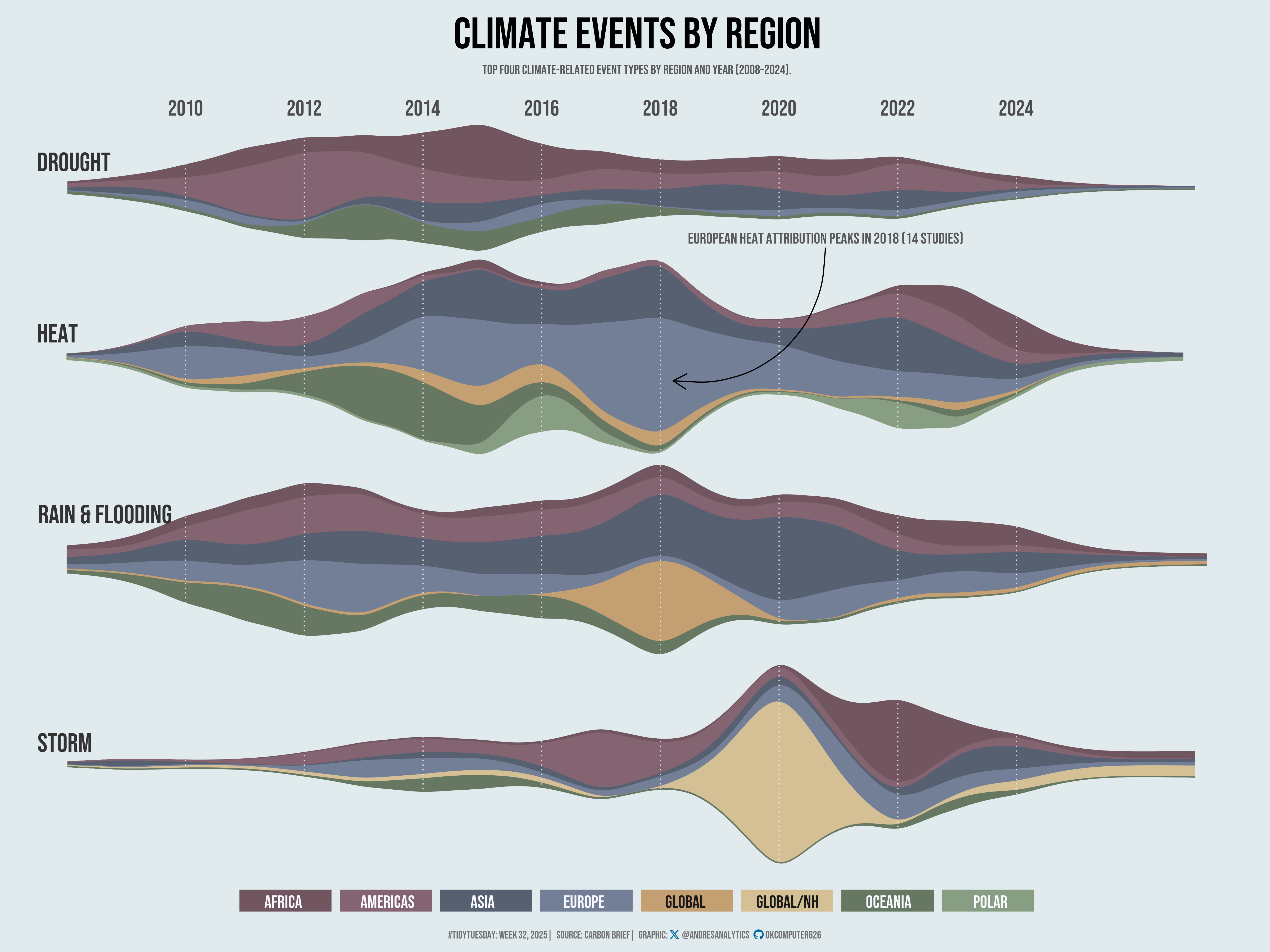
How This Graphic Was Made
1. 📦 Load Packages & Setup
2. 📖 Read in the Data
3. 🕵️ Examine the Data
# Display the structure of the agencies dataset, including column types and sample values
glimpse(attribution)

# Generate a detailed summary of the agencies dataset, including distribution and missing values
skim(attribution)
4. 🤼 Wrangle Data
# Count rows per study focus (quick sanity check of categories)
attribution %>%
  group_by(study_focus) %>%
  count()

# Identify the four most frequent event types in the entire dataset
four_events <- attribution %>%
  group_by(event_type) %>%
  count() %>%
  ungroup() %>%
  slice_max(n, n = 4) %>%
  pull(event_type)

# Peek at region and year values for cleaning decisions
unique(attribution$cb_region)
unique(attribution$event_year)

# Clean + standardize fields, then aggregate counts by year/type/region
attribution_clean <- attribution %>%
  # Keep only event-focused rows and the top-4 event types
  filter(study_focus == "Event",
         event_type %in% four_events) %>%
  # Drop missing year strings (ensures parsing below sees non-NA)
  drop_na(event_year) %>%
  # Parse event_year to a numeric single year and build region groups
  mutate(
    # Normalize event_year to a single numeric year
    event_year_fixed = case_when(
      str_detect(event_year, "^\\d{4}$") ~ as.numeric(event_year),              # exact year (e.g., "2012")
      str_detect(event_year, "^\\d{4}-\\d{4}$") ~ as.numeric(str_sub(event_year, 1, 4)), # year range: take start (e.g., "2010-2012" -> 2010)
      str_detect(event_year, "^\\d{4},\\s*\\d{4}") ~ as.numeric(str_extract(event_year, "^\\d{4}")), # comma list: take first (e.g., "2010, 2012")
      str_detect(event_year, "\\d{4}s") ~ as.numeric(str_extract(event_year, "\\d{4}")), # decade label: take decade start (e.g., "2010s" -> 2010)
      str_detect(event_year, "Mid-1990s") ~ 1995,                               # special case: mid-1990s -> 1995
      is.na(event_year) ~ NA_real_,                                             # (note: unreachable here due to drop_na)
      TRUE ~ NA_real_                                                           # fallback to NA if pattern not matched
    ),
    # Collapse CB regions to broader groups used in the figure
    region_group = case_when(
      cb_region %in% c("Europe") ~ "Europe",
      cb_region %in% c("Northern America", "Latin America and the Caribbean") ~ "Americas",
      cb_region %in% c("Sub-Saharan Africa", "Northern Africa and western Asia") ~ "Africa",
      cb_region %in% c("Eastern and south-eastern Asia", "Central and southern Asia") ~ "Asia",
      cb_region %in% c("Australia and New Zealand", "Oceania") ~ "Oceania",
      cb_region %in% c("Arctic", "Antarctica") ~ "Polar",
      cb_region == "Northern hemisphere" ~ "Global/NH",
      cb_region == "Global" ~ "Global",
      TRUE ~ "Other"                                                             # keep a catch-all bucket
    )
  ) %>%
  # Keep only fields needed for plotting and aggregate counts
  select(event_year_fixed, event_type, region_group) %>%
  group_by(event_year_fixed, event_type, region_group) %>%
  count() %>%
  arrange(desc(n)) %>%
  ungroup() %>%
  # Restrict time window to 2008+
  filter(event_year_fixed >= 2008)

# Recompute top 4 event types within the cleaned window (2008+)
top4 <- attribution_clean %>%
  group_by(event_type) %>%
  summarise(total = sum(n), .groups = "drop") %>%
  slice_max(total, n = 4) %>%
  pull(event_type)

# Build the final streamgraph input:
#  - keep top 4 types
#  - drop missing groups/years
#  - ensure every year in each (event_type, region_group) series exists (fill missing with 0)
df_stream <- attribution_clean %>%
  filter(event_type %in% top4,
         !is.na(event_year_fixed),
         !is.na(region_group)) %>%
  group_by(event_type, region_group, event_year_fixed) %>%
  summarise(n = sum(n), .groups = "drop") %>%
  group_by(event_type, region_group) %>%
  complete(
    event_year_fixed = seq(min(event_year_fixed), max(event_year_fixed), by = 1),
    fill = list(n = 0)
  ) %>%
  ungroup()
5. 🔤 Text
# Define the main title for the visualization
title <- "Climate Events by Region"

# Create a short description of the dataset focus
st <- "Top four climate-related event types by region and year (2008–2024)."

# Generate a social media caption with custom colors and font styling
social <- andresutils::social_caption(font_family = "Bebas", icon_color = "#086ca2", bg_color = "#E1EBEE", font_color = "grey45")

# Construct the final plot caption with TidyTuesday details, data source, and social caption
cap <- paste0(
  "#TidyTuesday: Week 32, 2025 | **Source**: Carbon Brief | **Graphic**: ", social
)

# Discrete palette (8 colors) for event types/regions; pass to scale_*_manual()
pal <- c("#715660", "#846470", "#566071", "#727f96", "#c39f72","#d5bf95", "#667762", "#879e82")
6. 📊 Plot
# Build the streamgraph of top climate event types by region (2008–2024)
p <- df_stream %>%
  ggplot(aes(
    x = event_year_fixed,
    y = n,
    color = region_group,
    fill = region_group
  )) +
  geom_hline(yintercept = 0, color = "#E1EBEE") +
  geom_stream(extra_span = .2,
              true_range = "none",
              type = "mirror") +
  geom_vline(
    data = tibble(x = c(seq(2010, 2024, by = 2))),
    aes(xintercept = x),
    inherit.aes = F,
    color = "#E1EBEE",
    size = .5,
    linetype = "dotted"
  ) +
  facet_grid(rows = vars(event_type),
             scales = "free_y",
             space = "free") +
  scale_x_continuous(
    limits = c(2008, NA),
    breaks = seq(2010, 2024, by = 2),
    position = "top"
  ) +
  scale_y_continuous(expand = c(.03, .03)) +
  coord_cartesian(clip = "off") +
  scale_color_manual(expand = c(0, 0),
                     values = pal,
                     guide = F) +
  scale_fill_manual(values = pal, name = NULL) +
  labs(title = title,
       subtitle = st,
       caption = cap) +
  theme_minimal(base_family = "Bebas", base_size = 12) +
  theme(
    plot.title = element_text(
      size = 40,
      face = "bold",
      hjust = 0.5,
      margin = margin(10, 0, 10, 0)
    ),
    plot.subtitle = element_text(
      hjust = 0.5,
      margin = margin(5, 0, 20, 0),
      color = "grey35"
    ),
    plot.caption = element_textbox(
      hjust = 0.5,
      color = "grey45",
      margin = margin(10, 0, 5, 0)
    ),
    axis.text.y = element_blank(),
    axis.text.x = element_text(size = 20),
    axis.title = element_blank(),
    plot.background = element_rect(fill = "#E1EBEE", color = NA),
    panel.grid = element_blank(),
    panel.spacing.y = unit(0, "lines"),
    strip.text.y = element_blank(),
    legend.position = "bottom",
    legend.text = element_blank(),
    legend.direction = "horizontal",
    legend.key.height = unit(0.75, "cm"),
    legend.key.width = unit(3, "cm")
  ) +
  guides(fill = guide_legend(nrow = 1))

# Compose final graphic and overlay region/event labels with cowplot
final <- ggdraw(p) +
  annotate("text", x = 0.65, y = 0.75, label = "European heat attribution peaks in 2018 (14 studies)", size = 5, color = "grey35", family = "Bebas") +
  annotate("curve", x = 0.65, y = 0.74, xend = 0.53, yend = 0.6, curvature = -0.5, arrow = arrow(length = unit(0.5, 'cm'))) +
  draw_text(
    text = "Africa",
    x = 0.223,
    y = 0.053,
    size = 16,
    family = "Bebas",
    fontface = "bold",
    color = "#F8F8FF"
  ) +
  draw_text(
    text = "Americas",
    x = 0.305,
    y = 0.053,
    size = 16,
    family = "Bebas",
    fontface = "bold",
    color = "#F8F8FF"
  ) +
  draw_text(
    text = "Asia",
    x = 0.38,
    y = 0.053,
    size = 16,
    family = "Bebas",
    fontface = "bold",
    color = "#F8F8FF"
  ) +
  draw_text(
    text = "Europe",
    x = 0.46,
    y = 0.053,
    size = 16,
    family = "Bebas",
    fontface = "bold",
    color = "#F8F8FF"
  ) +
  draw_text(
    text = "Global",
    x = 0.54,
    y = 0.053,
    size = 16,
    family = "Bebas",
    fontface = "bold",
    color = "grey10"
  ) +
  draw_text(
    text = "Global/NH",
    x = 0.62,
    y = 0.053,
    size = 16,
    family = "Bebas",
    fontface = "bold",
    color = "grey10"
  ) +
  draw_text(
    text = "Oceania",
    x = 0.70,
    y = 0.053,
    size = 16,
    family = "Bebas",
    fontface = "bold",
    color = "#F8F8FF"
  ) +
  draw_text(
    text = "Polar",
    x = 0.78,
    y = 0.053,
    size = 16,
    family = "Bebas",
    fontface = "bold",
    color = "#F8F8FF"
  ) +
  draw_text(
    text = "Drought",
    x = 0.03,
    y = 0.83,
    size = 24,
    family = "Bebas",
    fontface = "bold",
    color = "grey20",
    hjust = 0
  ) +
  draw_text(
    text = "Heat",
    x = 0.03,
    y = 0.65,
    size = 24,
    family = "Bebas",
    fontface = "bold",
    color = "grey20",
    hjust = 0
  ) +
  draw_text(
    text = "Rain & flooding",
    x = 0.03,
    y = 0.46,
    size = 24,
    family = "Bebas",
    fontface = "bold",
    color = "grey20",
    hjust = 0
  ) +
  draw_text(
    text = "Storm",
    x = 0.03,
    y = 0.22,
    size = 24,
    family = "Bebas",
    fontface = "bold",
    color = "grey20",
    hjust = 0
  )
7. 💾 Save
# Save the plot for TidyTuesday 2025, Week 07 with specified dimensions.
andresutils::save_plot(final, type = "tidytuesday", year = 2025, week = 32, width = 16, height = 12)
8. 🚀 GitHub Repository
TipExpand for GitHub Repo
The complete code for this analysis is available in tt_32_2025.qmd.
For the full repository, click here.
Citation
For attribution, please cite this work as:
Gonzalez, Andres. 2025. “Climate Events by Region
(2008–2024).” August 7, 2025. https://andresgonzalezstats.com/visualization/TidyTuesday/2025/Week_32/tt_32_2025.html.