# Load necessary packages using pacman for easier dependency management
pacman::p_load(
  tidyverse,   # Collection of R packages for data science (ggplot2, dplyr, etc.)
  showtext,    # Enables custom fonts for ggplot2
  ggtext,      # Adds rich text formatting to ggplot2
  skimr,       # Provides summary statistics in a readable format
  glue,
  janitor,
  ggbump,
  ggflags,
  patchwork,
  ggrepel
)

# Add Google fonts
font_add_google("Fjalla One", family = "Fjalla")

# Add local font
font_add("Font Awesome 6 Brands", here::here("fonts/otfs/Font Awesome 6 Brands-Regular-400.otf"))

# Automatically enable the use of showtext for all plots
showtext_auto()

# Set DPI for high-resolution text rendering
showtext_opts(dpi = 300)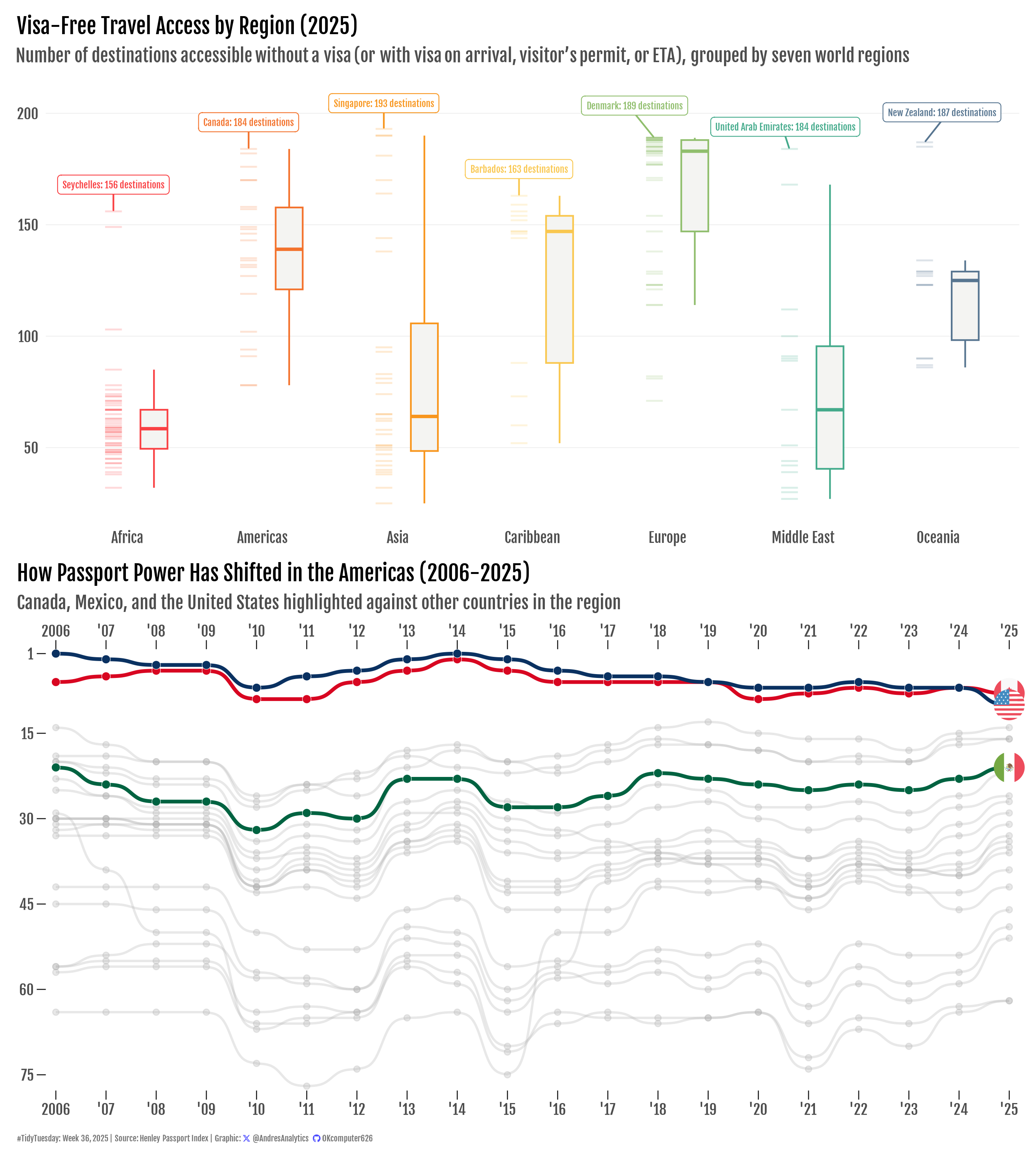
How This Graphic Was Made
1. 📦 Load Packages & Setup
2. 📖 Read in the Data
# Load the TidyTuesday data
tuesdata <- tidytuesdayR::tt_load(2025, week = 36)

# Extract dataset and clean column names
country <- tuesdata$country_lists %>% clean_names()
rank <- tuesdata$rank_by_year %>% clean_names()

# Show the README for context
tidytuesdayR::readme(tuesdata)

# Drop the list to free memory
rm(tuesdata)
3. 🕵️ Examine the Data
# Display the structure of the agencies dataset, including column types and sample values
glimpse(country)
glimpse(rank)

# Generate a detailed summary of the agencies dataset, including distribution and missing values
skim(country)
skim(rank)
4. 🤼 Wrangle Data
df_2025 <- rank %>%
  filter(year %in% 2025) %>%
  drop_na(visa_free_count) %>%
  mutate(region = factor(str_to_title(region),
                         levels = sort(unique(str_to_title(region)))))

americas <- rank %>%
  filter(region == "AMERICAS")

top_country <- df_2025 %>%
  group_by(region) %>%
  slice_max(visa_free_count, n = 1, with_ties = FALSE) %>%
  ungroup()
5. 🔤 Text
region_colors <- c(
  "Africa" = "#f94144",
  "Americas"   = "#f3722c",
  "Asia" = "#f8961e",
  "Caribbean"  = "#f9c74f",
  "Europe" = "#90be6d",
  "Middle East" = "#43aa8b",
  "Oceania" = "#577590"
)

# Define your custom colors
country_colors <- c(
  "Mexico"        = "#006341", # green
  "Canada"        = "#D80621", # red
  "United States" = "#0A3161"  # blue
)

# Generate a social media caption with custom colors and font styling
social <- andresutils::social_caption(font_family = "Fjalla", icon_color = "#4D4DFF", font_color = "grey45")

# Construct the final plot caption with TidyTuesday details, data source, and social caption
cap <- paste0(
  "#TidyTuesday: Week 36, 2025 | **Source**: Henley Passport Index | **Graphic**: ", social
)
6. 📊 Plot
p1 <- df_2025 %>%
  ggplot(aes(x = region, y = visa_free_count, color = region)) +
  geom_boxplot(
    width = .2,
    outlier.shape = NA,
    fill = "#f4f4f2",
    position = position_nudge(x = 0.2, y = 0)
  ) +
  geom_point(
    shape = 95,
    size = 6,
    alpha = .2,
    position = position_nudge(x = -0.1, y = 0)
  ) +
  geom_label_repel(
    data = top_country,
    aes(label = paste0(
      country, ": ", visa_free_count, " destinations"
    ), x = as.numeric(region) - 0.1),
    family = "Fjalla",
    size = 2,
    nudge_y = 12,
    box.padding = 0.5
  ) +
  scale_color_manual(values = region_colors) +
  labs(title = "Visa-Free Travel Access by Region (2025)", subtitle = "Number of destinations accessible without a visa (or with visa on arrival, visitor’s permit, or ETA), grouped by seven world regions") +
  theme_minimal() +
  theme(
    text = element_text(family = "Fjalla"),
    plot.title.position = "plot",
    plot.title = element_text(face = "bold"),
    plot.subtitle = element_textbox_simple(color = "grey30", margin = margin(b = 10)),
    legend.position = "none",
    axis.title = element_blank(),
    panel.grid = element_line(size = 0.2),
    panel.grid.minor = element_blank(),
    panel.grid.major.x = element_blank(),
    margin = margin(5, 5, 5, 5)
  )


p2 <- americas %>% drop_na(visa_free_count) %>%
  ggplot(aes(x = year, y = rank)) +
  geom_bump(
    data = americas %>% filter(!country %in% c("Canada", "Mexico", "United States")),
    aes(group = country),
    size = .7,
    alpha = 0.3,
    color = "grey70",
    show.legend = FALSE,
    smooth = 5
  ) +
  geom_point(
    data = americas %>% filter(!country %in% c("Canada", "Mexico", "United States")),
    alpha = 0.3,
    color = "grey70"
  ) +
  geom_bump(
    data = americas %>% filter(country %in% c("Canada", "Mexico", "United States")),
    aes(group = country, color = country),
    size = 1.1,
    show.legend = FALSE,
    smooth = 5
  ) +
  geom_point(
    data = americas %>% filter(country %in% c("Canada", "Mexico", "United States")),
    aes(fill = country),
    size = 2.4,
    shape = 21,
    show.legend = FALSE,
    color = "#FFFFFF",
    stroke = 0.2
  ) +
geom_flag(
    data = americas %>%
      filter(country %in% c("Canada", "Mexico", "United States"),
             year == max(year)) %>%
      mutate(code = tolower(code)) %>%
      filter(!is.na(code), nchar(code) == 2),
    aes(country = code),
    size = 8
  ) +
scale_color_manual(values = country_colors) +
  scale_fill_manual(values = country_colors) +
  scale_x_continuous(
    expand = c(0.01, 0.01),
    breaks = seq(2006, 2025, by = 1),
    labels = function(x)
      ifelse(
        x == 2006,
        as.character(x),
        paste0("'", substr(x, 3, 4))
      ),
    # abbreviated
    sec.axis = dup_axis()
  ) +
  scale_y_reverse(breaks = c(1, 15, 30, 45, 60, 75),
                  expand = c(0.01, 0.01)) +
  coord_cartesian(clip = "off") +
  labs(
    title = "How Passport Power Has Shifted in the Americas (2006-2025)",
    subtitle = "Canada, Mexico, and the United States highlighted against other countries in the region"
  ) +
  theme_minimal() +
  theme(
    text = element_text(family = "Fjalla"),
    plot.title.position = "plot",
    plot.title = element_text(face = "bold"),
    plot.subtitle = element_text(color = "grey30"),
    axis.title = element_blank(),
    panel.grid = element_blank(),
    axis.ticks.length = unit(.2, "cm"),
    axis.ticks = element_line(color = "grey10", size = .3),
    margin = margin(5, 5, 5, 5)
  )

final_plot <- (p1 / p2) +
  plot_annotation(
    caption = cap,
    theme = theme(
      text = element_text(family = "Fjalla"),
      plot.caption = element_markdown(
        size = 5,
        hjust = 0,
        color = "grey45",
        margin = margin(t = 5)
      ),
      plot.margin = margin(5, 5, 5, 5)
    )
  )
7. 💾 Save
# Save the plot for TidyTuesday 2025, Week 07 with specified dimensions.
andresutils::save_plot(final_plot, type = "tidytuesday", year = 2025, week = 36, width = 9, height = 10)
8. 🚀 GitHub Repository
TipExpand for GitHub Repo
The complete code for this analysis is available in tt_36_2025.qmd.
For the full repository, click here.
Citation
For attribution, please cite this work as:
Gonzalez, Andres. 2025. “Passport Power in the Americas and
Beyond.” September 15, 2025. https://andresgonzalezstats.com/visualization/TidyTuesday/2025/Week_36/tt_36_2025.html.