# Load necessary packages using pacman for easier dependency management
pacman::p_load(
  tidyverse,   # Collection of R packages for data science (ggplot2, dplyr, etc.)
  showtext,    # Enables custom fonts for ggplot2
  ggtext,      # Adds rich text formatting to ggplot2
  skimr,       # Provides summary statistics in a readable format
  janitor,
  glue,
  gridmappr,
  geofacet
)

# Add Google fonts
font_add_google("Roboto Condensed", family = "Roboto")

# Add local font
font_add("Font Awesome 6 Brands", here::here("fonts/otfs/Font Awesome 6 Brands-Regular-400.otf"))

# Automatically enable the use of showtext for all plots
showtext_auto()

# Set DPI for high-resolution text rendering
showtext_opts(dpi = 300)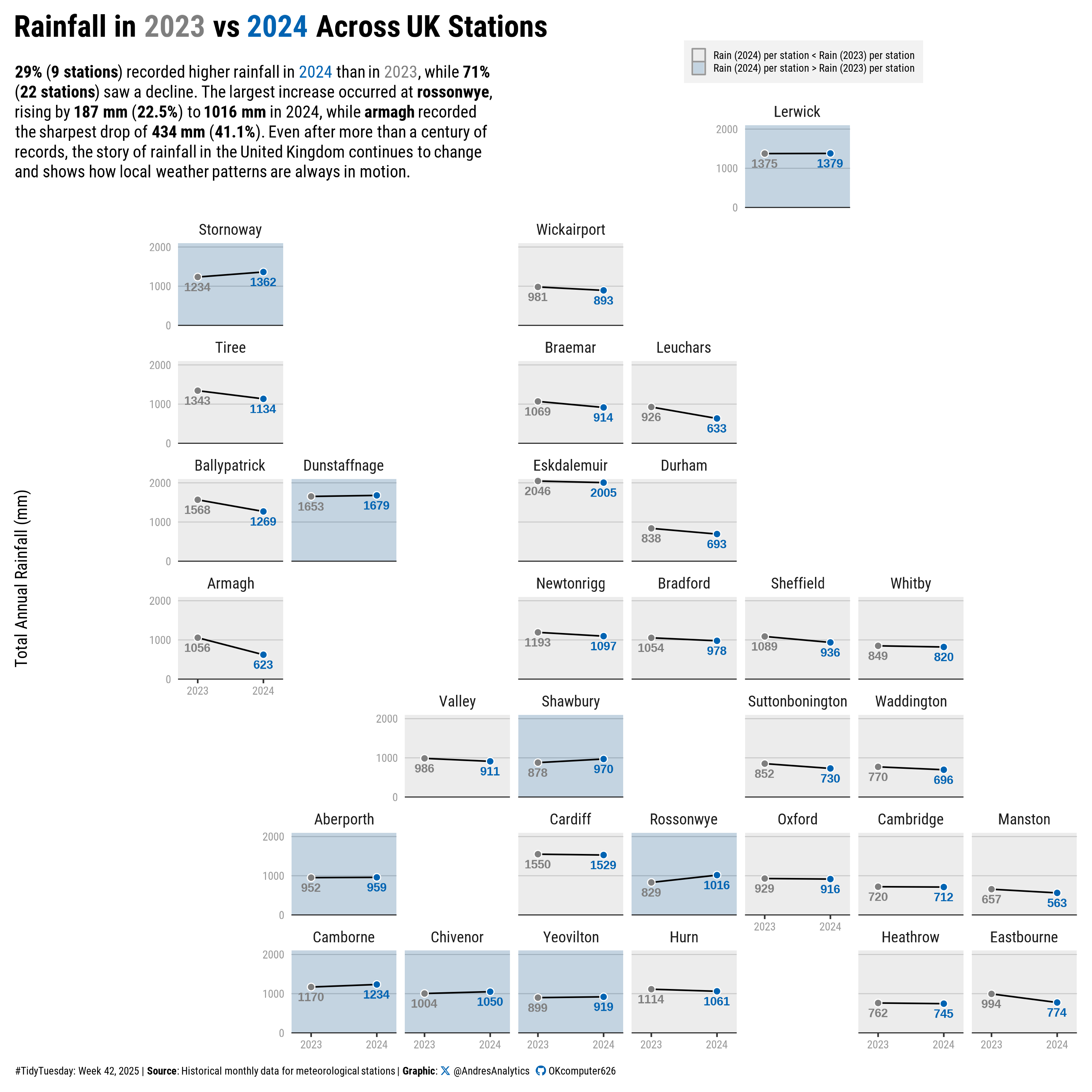
How This Graphic Was Made
1. 📦 Load Packages & Setup
2. 📖 Read in the Data
# Load the TidyTuesday data
tuesdata <- tidytuesdayR::tt_load(2025, week = 42)

# Extract dataset and clean column names
historic <- tuesdata$historic_station_met %>% clean_names()
station <- tuesdata$station_meta %>% clean_names()

# Show the README for context
tidytuesdayR::readme(tuesdata)

# Drop the list to free memory
rm(tuesdata)
3. 🕵️ Examine the Data
glimpse(historic)
glimpse(station)
4. 🤼 Wrangle Data
# Inputs to grid
pts <- station %>%
  select(area_name = station, x = lng, y = lat)

solution <- points_to_grid(
  pts,
  n_row = 10, n_col = 10,
  compactness = 0.6
)

my_grid <- solution %>%
  transmute(name = area_name, code = area_name, row, col) %>%
  arrange(row, col)

# Flip grid vertically (top-left origin)
my_grid_flipped <- my_grid %>%
  mutate(row = max(row) - row + 1)

# Annual totals
annual_rain <- historic %>%
  group_by(station, year) %>%
  summarise(value = sum(rain, na.rm = TRUE), .groups = "drop")

# Choose years (prefer 2023 vs 2024; else earliest vs latest)
years_avail <- sort(unique(annual_rain$year))
target_years <- c(2023, 2024)
if (!all(target_years %in% years_avail)) target_years <- range(years_avail)
year_a <- target_years[1]
year_b <- target_years[2]

# Keep stations that have both years
cmp <- annual_rain %>%
  filter(year %in% c(year_a, year_b)) %>%
  left_join(station %>% select(station, station_name), by = "station") %>%
  group_by(station) %>%
  filter(n_distinct(year) == 2) %>%
  ungroup()

plot_df <- cmp

# Keep only stations that appear on the grid
grid_use <- my_grid_flipped %>%
  semi_join(
    plot_df %>% distinct(station) %>% rename(code = station),
    by = "code"
  )

# Align factor order to grid order
plot_df2 <- plot_df %>%
  mutate(station = factor(station, levels = grid_use$code))

grid_use2 <- grid_use %>%
  mutate(name = str_to_title(name))

# Compare totals between the two years
data2 <- plot_df2 %>%
  group_by(station) %>%
  summarise(
    val_a = sum(value[year == year_a], na.rm = TRUE),
    val_b = sum(value[year == year_b], na.rm = TRUE),
    .groups = "drop"
  ) %>%
  mutate(
    group = if_else(val_b > val_a, "Increase", "Decrease"),
    change = val_b - val_a,
    pct_change = round((change / if_else(val_a == 0, NA_real_, val_a)) * 100, 1)
  )

# Shares of Increase / Decrease (robust if a group is missing)
percentage <- data2 %>%
  count(group, name = "count") %>%
  tidyr::complete(group = c("Increase", "Decrease"), fill = list(count = 0)) %>%
  mutate(relative_frequency = round(count / sum(count), 2))

inc <- percentage %>% filter(group == "Increase") %>% pull(relative_frequency) * 100
dec <- percentage %>% filter(group == "Decrease") %>% pull(relative_frequency) * 100

# Largest increase / decrease
largest_inc <- data2 %>% filter(change == max(change, na.rm = TRUE)) %>% slice(1)
largest_dec <- data2 %>% filter(change == min(change, na.rm = TRUE)) %>% slice(1)

station_inc <- largest_inc$station
change_inc  <- round(largest_inc$change)
pct_inc     <- largest_inc$pct_change
val_inc_b   <- round(largest_inc$val_b)

station_dec <- largest_dec$station
change_dec  <- round(largest_dec$change)
pct_dec     <- largest_dec$pct_change
val_dec_b   <- round(largest_dec$val_b)

# explicit counts
count_inc <- percentage %>% filter(group == "Increase") %>% pull(count)
count_dec <- percentage %>% filter(group == "Decrease") %>% pull(count)

data2 <- data2 %>%
  mutate(
    group_simple = factor(group, levels = c("Increase", "Decrease")),
    group_label  = case_when(
      val_b > val_a ~ sprintf("Rain (%d) per station > Rain (%d) per station", year_b, year_a),
      val_b < val_a ~ sprintf("Rain (%d) per station < Rain (%d) per station", year_b, year_a),
      TRUE          ~ NA_character_
    )
  )
5. 🔤 Text
# Generate a social media caption with custom colors and font styling
social <- andresutils::social_caption(font_family = "Roboto", icon_color = "#0063B2")

# Construct the final plot caption with TidyTuesday details, data source, and social caption
cap <- paste0(
  "#TidyTuesday: Week 42, 2025 | **Source**: Historical monthly data for meteorological stations | **Graphic**: ", social
)

title <- "Rainfall in <span style='color:grey50;'>2023</span> vs <span style='color:#0063B2;'>2024</span> Across UK Stations"

subtitle <- glue(
  "<b>{round(inc)}%</b> (<b>{count_inc} stations</b>) recorded higher rainfall in
  <span style='color:#0063B2;'>2024</span> than in
  <span style='color:grey50;'>2023</span>, while <b>{round(dec)}%</b> (<b>{count_dec} stations</b>) saw a decline.
  The largest increase occurred at <b>{station_inc}</b>, rising by <b>{change_inc} mm</b>
  (<b>{pct_inc}%</b>) to <b>{val_inc_b} mm</b> in 2024,
  while <b>{station_dec}</b> recorded the sharpest drop of <b>{abs(change_dec)} mm</b>
  (<b>{abs(pct_dec)}%</b>).
  Even after more than a century of records, the story of rainfall in the United Kingdom continues to change and shows how local weather patterns are always in motion."
)
6. 📊 Plot
# rectangle
bg_df <- data2 %>%
  transmute(station, group_simple, group_label,
            xmin = -Inf, xmax = Inf, ymin = -Inf, ymax = Inf)

# plot
p <- plot_df2 %>%
  ggplot(aes(x = year, y = value, color = factor(year))) +
  # Background mapped to the verbose label (shows legend like his)
  geom_rect(
    data = bg_df,
    inherit.aes = FALSE,
    aes(
      xmin = xmin,
      xmax = xmax,
      ymin = ymin,
      ymax = ymax,
      fill = group_label
    ),
    alpha = 1 / 6,
    color = NA
  ) +
  scale_fill_manual(name = NULL,
                    values = setNames(c("#0063B2", "grey95"), c(
                      sprintf("Rain (%d) per station > Rain (%d) per station", year_b, year_a),
                      sprintf("Rain (%d) per station < Rain (%d) per station", year_b, year_a)
                    )),
                    na.translate = FALSE) +
  ggnewscale::new_scale_fill() +   # reset fill for points
  geom_line(aes(group = station),
            show.legend = F,
            color = "#000000") +
  geom_hline(yintercept = 0,
             color = "grey10",
             size = .3) +
  geom_point(
    aes(fill = factor(year)),
    show.legend = F,
    size = 2,
    stroke = 0.5,
    shape = 21,
    color = "#ffffff"
  ) +
  geom_text(
    aes(label = round(value), color = factor(year)),
    show.legend = F,
    size = 2.8,
    fontface = "bold",
    vjust = 1.7
  ) +
  scale_color_manual(values = rev(c("#0063B2", "grey50"))) +
  scale_fill_manual(values = rev(c("#0063B2", "grey50"))) +
  facet_geo( ~ station, grid = grid_use2, label = "name") +
  scale_x_continuous(limits = c(2022.7, 2024.3),
                     breaks = c(2023, 2024)) +
  scale_y_continuous(breaks = seq(0, 2000, by = 1000), limit = c(0, 2100)) +
  coord_cartesian(clip = "off", expand = F) +
  labs(
    title = title,
    subtitle = subtitle,
    caption = cap,
    x = NULL,
    y = "Total Annual Rainfall (mm)"
  ) +
  theme(
    text = element_text(family = "Roboto"),
    axis.text = element_text(color = "#999999", size = 7.5),
    plot.title.position = "plot",
    plot.caption.position = "plot",
    plot.title = element_textbox_simple(
      face = "bold",
      size = 20,
      margin = margin(b = 15)
    ),
    plot.subtitle = element_textbox_simple(
      maxwidth = 0.45,
      halign = 0,
      hjust = 0,
      lineheight = 1.2,
      margin = margin(b = -55)
    ),
    plot.caption = element_textbox_simple(size = 7, margin = margin(t = 10)),
    strip.background = element_blank(),
    panel.grid = element_blank(),
    panel.grid.major.y = element_line(size = 0.3, color = "grey75"),
    strip.text.x = element_text(size = 10),
    axis.ticks.y = element_blank(),
    legend.position = c(0.73, 1.07),
    legend.key.size = unit(0.3, "cm"),
    legend.key = element_rect(colour = "grey60"),
    legend.text = element_text(size = 7),
    legend.background = element_rect(fill = "grey95"),
    plot.margin = margin(10, 10, 10, 10)
  )
7. 💾 Save
# Save the plot for TidyTuesday 2025, Week 42 with specified dimensions.
andresutils::save_plot(p, type = "tidytuesday", year = 2025, week = 42, width = 10, height = 10)
8. 🚀 GitHub Repository
TipExpand for GitHub Repo
The complete code for this analysis is available in tt_42_2025.qmd.
For the full repository, click here.
Citation
For attribution, please cite this work as:
Gonzalez, Andres. 2025. “Historic UK Meteorological & Climate
Data.” October 26, 2025. https://andresgonzalezstats.com/visualization/TidyTuesday/2025/Week_42/tt_42_2025.html.