# Load necessary packages using pacman for easier dependency management
pacman::p_load(
  tidyverse,   # Collection of R packages for data science (ggplot2, dplyr, etc.)
  showtext,    # Enables custom fonts for ggplot2
  ggtext,      # Adds rich text formatting to ggplot2
  skimr,       # Provides summary statistics in a readable format
  glue,
  janitor,
  gganimate,
  ggrepel,
  legendry
)

# Add Google fonts
font_add_google("Oswald", family = "Oswald")
font_add_google("Roboto Condensed", family = "Roboto")

# Add local font
font_add("Font Awesome 6 Brands", here::here("fonts/otfs/Font Awesome 6 Brands-Regular-400.otf"))

# Automatically enable the use of showtext for all plots
showtext_auto()

# Set DPI for high-resolution text rendering
showtext_opts(dpi = 300)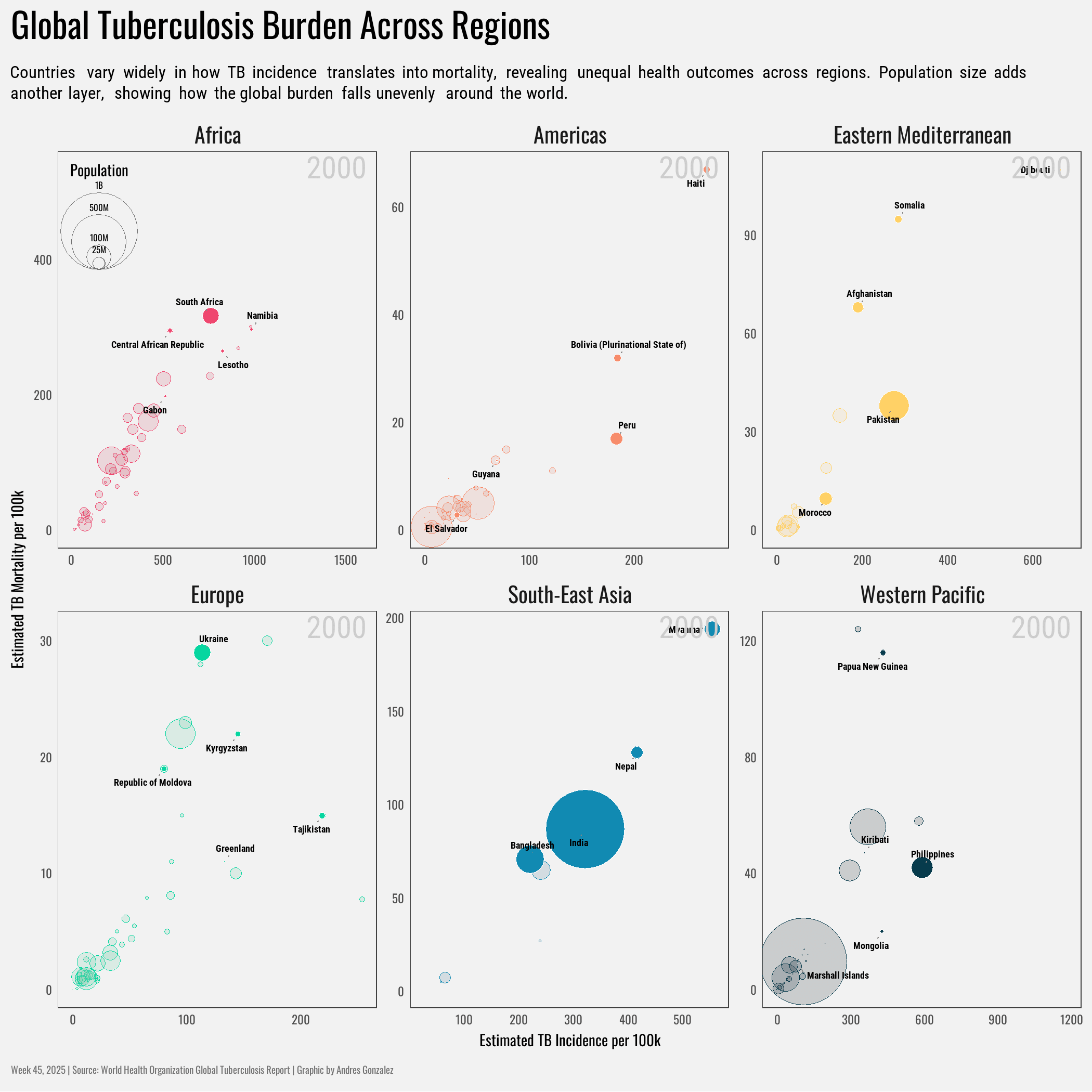
How This Graphic Was Made
1. 📦 Load Packages & Setup
2. 📖 Read in the Data
3. 🕵️ Examine the Data
glimpse(who_tb_data)
skim(who_tb_data)
4. 🤼 Wrangle Data
# A tibble: 24 × 18
   country   g_whoregion iso_numeric iso2  iso3   year c_cdr c_newinc_100k   cfr
   <chr>     <chr>             <dbl> <chr> <chr> <dbl> <dbl>         <dbl> <dbl>
 1 Democrat… South-East…         408 KP    PRK    2000    28           144  0.31
 2 Democrat… South-East…         408 KP    PRK    2001    24           123  0.33
 3 Democrat… South-East…         408 KP    PRK    2002    33           168  0.3
 4 Democrat… South-East…         408 KP    PRK    2003    40           205  0.27
 5 Democrat… South-East…         408 KP    PRK    2004    36           184  0.28
 6 Democrat… South-East…         408 KP    PRK    2005    34           175  0.29
 7 Democrat… South-East…         408 KP    PRK    2006    35           182  0.29
 8 Democrat… South-East…         408 KP    PRK    2007    47           239  0.24
 9 Democrat… South-East…         408 KP    PRK    2008    57           293  0.2
10 Democrat… South-East…         408 KP    PRK    2009    60           307  0.19
# ℹ 14 more rows
# ℹ 9 more variables: e_inc_100k <dbl>, e_inc_num <dbl>, e_mort_100k <dbl>,
#   e_mort_exc_tbhiv_100k <dbl>, e_mort_exc_tbhiv_num <dbl>, e_mort_num <dbl>,
# e_mort_tbhiv_100k <dbl>, e_mort_tbhiv_num <dbl>, e_pop_num <dbl>5. 🔤 Text
cap <- "Week 45, 2025 | Source: World Health Organization Global Tuberculosis Report | Graphic by Andres Gonzalez"6. 📊 Plot
p <- who_tb_data %>%
  ggplot(aes(x = e_inc_100k, y = e_mort_100k)) +
  facet_wrap( ~ g_whoregion, scales = "free") +
  geom_point(
    data = ~ filter(., !country %in% highlighted_countries),
    aes(
      size = e_pop_num,
      colour = g_whoregion,
      fill = stage(g_whoregion, after_scale = alpha(colorspace::desaturate(fill, 0.4), 0.2))
    ),
    shape = 21,
    stroke = 0.2
  ) +
  geom_point(
    data = ~ filter(., country %in% highlighted_countries),
    aes(size = e_pop_num, fill = g_whoregion),
    shape = 21,
    col = "white",
    stroke = 0.15
  ) +
  geom_text_repel(
    data = . %>% filter(country %in% highlighted_countries),
    aes(label = country),
    fill = alpha("grey92", 0.5),
    segment.color = "grey52",
    size = 1.5,
    family = "Roboto",
    fontface = "bold",
    seed = 10,
    point.padding = 0.25,
    min.segment.length = 0,
    segment.size = 0.25
  ) +
  scale_fill_manual(
    values = c(
      "#ef476f",
      "#f78c6b",
      "#ffd166",
      "#06d6a0",
      "#118ab2",
      "#073b4c"
    ),
    aesthetics = c("fill", "col")
  ) +
  scale_size_area(
    max_size = 20,
    breaks = c(25, 100, 500, 1000) * 1e6,
    labels = c("25M", "100M", "500M", "1B"),
  guide = guide_circles(
    override.aes = aes(colour = "grey45"),
    title = "Population",
    text_position = "ontop",
    # style just this guide
    theme = theme(
      legend.title = element_text(hjust = 0.5),
      legend.text  = element_text(vjust = -0.5, size = 4)
    )
  )
) +
  guides(fill = "none",
         color = "none") +
  labs(
    title = "Global Tuberculosis Burden Across Regions",
    subtitle = "Countries vary widely in how TB incidence translates into mortality, revealing unequal health outcomes across regions. Population size adds another layer, showing how the global burden falls unevenly around the world.",
    caption = cap,
    x = "Estimated TB Incidence per 100k",
    y = "Estimated TB Mortality per 100k"
  ) +
  theme_minimal(base_size = 7, base_family = "Oswald") +
  theme(
    plot.title = element_text(
      size = 16,
      face = "bold",
      margin = margin(b = 5)
    ),
    plot.title.position = "plot",
    plot.subtitle = element_textbox_simple(
      family = "Roboto",
      margin = margin(b = 7),
      size = 8
    ),
    plot.caption = element_text(
      color = "grey45",
      size = 4.5,
      hjust = 0,
      halign = 0,
      margin = margin(t = 7)
    ),
    plot.caption.position = "plot",
    plot.margin = margin(5, 5, 5, 5),
    panel.grid = element_blank(),
    panel.background = element_rect(fill = "grey95", color = "grey25"),
    plot.background = element_rect(fill = "grey95"),
    strip.text = element_text(size = 10),
    legend.position = c(0.04, 0.92)
  ) +
    transition_states(year) +
    geom_text(aes(label = scales::number(year, accuracy = 1, big.mark = ""),
                x = Inf, y = Inf),
            stat = "unique", color = "grey80", size = 5,
            family = "Roboto",
            vjust = 1.2, hjust = 1.2)

p <- animate(p, height = 7, width = 7, units = "in", res = 300, renderer = magick_renderer(loop = FALSE), duration = 15,
  fps = 10,
  end_pause = 36)

p1 <- who_tb_data %>%
  ggplot(aes(x = e_inc_100k, y = e_mort_100k)) +
  facet_wrap( ~ g_whoregion, scales = "free") +
  geom_point(
    data = ~ filter(., !country %in% highlighted_countries),
    aes(
      size = e_pop_num,
      colour = g_whoregion,
      fill = stage(g_whoregion, after_scale = alpha(colorspace::desaturate(fill, 0.4), 0.2))
    ),
    shape = 21,
    stroke = 0.2
  ) +
  geom_point(
    data = ~ filter(., country %in% highlighted_countries),
    aes(size = e_pop_num, fill = g_whoregion),
    shape = 21,
    col = "white",
    stroke = 0.15
  ) +
  geom_text_repel(
    data = . %>% filter(country %in% highlighted_countries),
    aes(label = country),
    fill = alpha("grey92", 0.5),
    segment.color = "grey52",
    size = 1.5,
    family = "Roboto",
    fontface = "bold",
    seed = 10,
    point.padding = 0.25,
    min.segment.length = 0,
    segment.size = 0.25
  ) +
  scale_fill_manual(
    values = c(
      "#ef476f",
      "#f78c6b",
      "#ffd166",
      "#06d6a0",
      "#118ab2",
      "#073b4c"
    ),
    aesthetics = c("fill", "col")
  ) +
  scale_size_area(
    max_size = 20,
    breaks = c(25, 100, 500, 1000) * 1e6,
    labels = c("25M", "100M", "500M", "1B"),
  guide = guide_circles(
    override.aes = aes(colour = "grey45"),
    title = "Population",
    text_position = "ontop",
    # style just this guide
    theme = theme(
      legend.title = element_text(hjust = 0.5),
      legend.text  = element_text(vjust = -0.5, size = 4)
    )
  )
) +
  guides(fill = "none",
         color = "none") +
  labs(
    title = "Global Tuberculosis Burden Across Regions",
    subtitle = "Countries vary widely in how TB incidence translates into mortality, revealing unequal health outcomes across regions. Population size adds another layer, showing how the global burden falls unevenly around the world.",
    caption = cap,
    x = "Estimated TB Incidence per 100k",
    y = "Estimated TB Mortality per 100k"
  ) +
  theme_minimal(base_size = 7, base_family = "Oswald") +
  theme(
    plot.title = element_text(
      size = 16,
      face = "bold",
      margin = margin(b = 5)
    ),
    plot.title.position = "plot",
    plot.subtitle = element_textbox_simple(
      family = "Roboto",
      margin = margin(b = 7),
      size = 8
    ),
    plot.caption = element_text(
      color = "grey45",
      size = 4.5,
      hjust = 0,
      halign = 0,
      margin = margin(t = 7)
    ),
    plot.caption.position = "plot",
    plot.margin = margin(5, 5, 5, 5),
    panel.grid = element_blank(),
    panel.background = element_rect(fill = "grey95", color = "grey25"),
    plot.background = element_rect(fill = "grey95"),
    strip.text = element_text(size = 10),
    legend.position = c(0.04, 0.92)
  )
7. 💾 Save
# Save Animation
anim_save("tt_45_2025.gif", p)

# Save the plot for TidyTuesday 2025, Week 45 with specified dimensions.
andresutils::save_plot(p1, type = "tidytuesday", year = 2025, week = 45, width = 9, height = 9)
8. 🚀 GitHub Repository
TipExpand for GitHub Repo
The complete code for this analysis is available in tt_45_2025.qmd.
For the full repository, click here.
Citation
For attribution, please cite this work as:
Gonzalez, Andres. 2025. “Global Patterns in Tuberculosis Incidence
and Mortality.” November 12, 2025. https://andresgonzalezstats.com/visualization/TidyTuesday/2025/Week_45/tt_45_2025.html.